
Refill, Reuse, Redesign: Smarter Packaging for Care and Clean

Life-cycle impact made tangible

When behavior meets design
A business case that scales
Material Breakthroughs You Can Actually Reuse


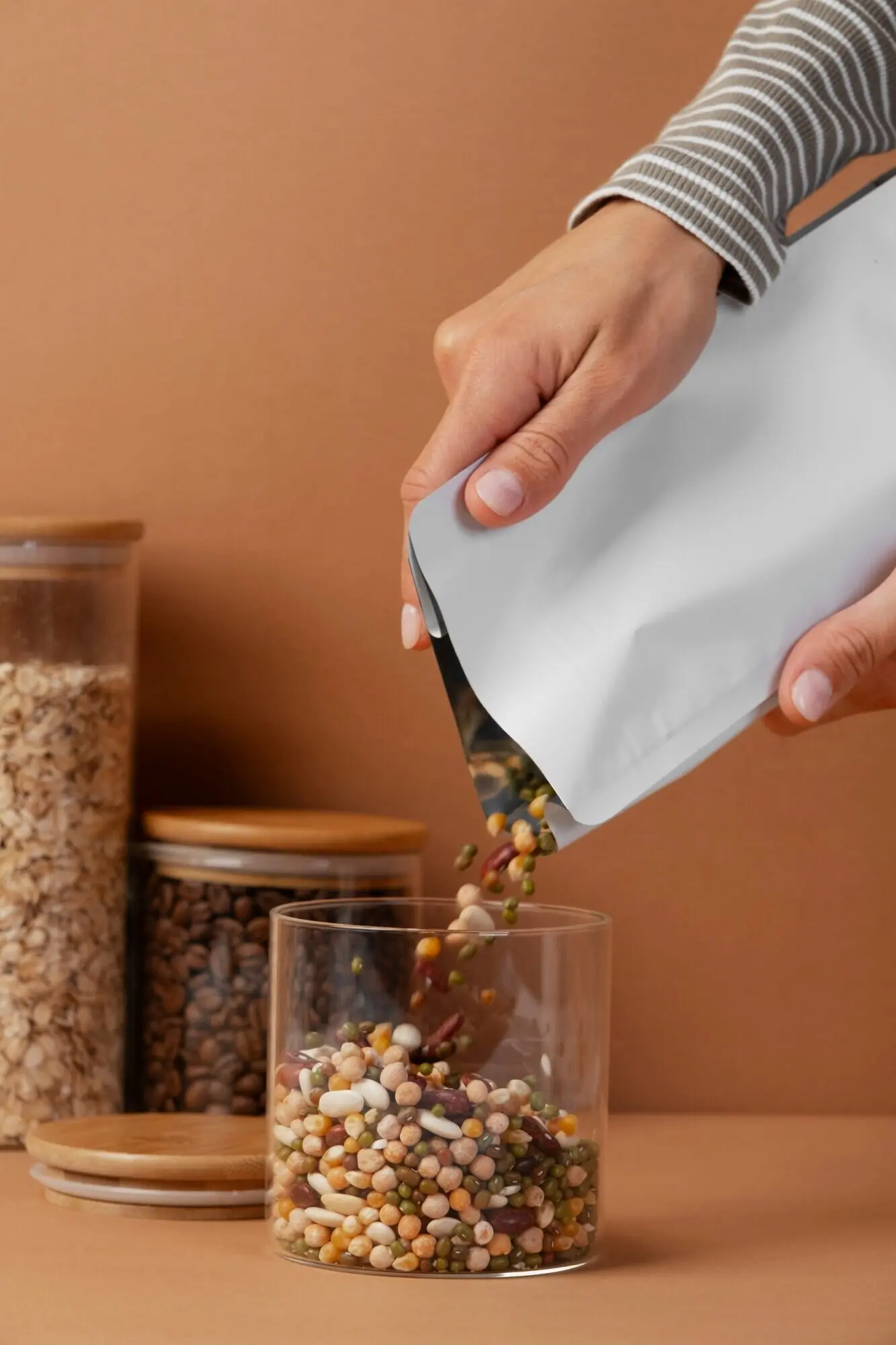
Mechanics of a Great Refill Experience

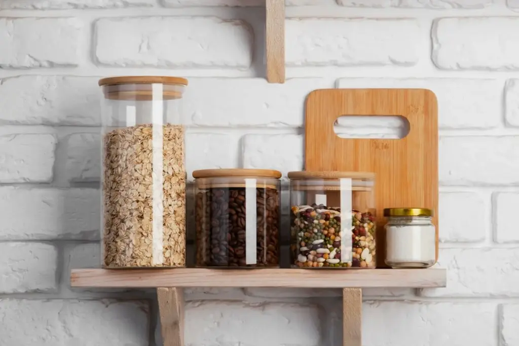
Refill Formats: Concentrates, Tablets, and Stations
Design for Hygiene and All-User Accessibility
Clean touchpoints that stay fresh
Smooth pump heads, minimal part lines, and easy-to-rinse channels prevent soap film and bacterial harborage. Caps should park securely without touching wet counters. Anti-microbial claims require caution and evidence; design-first cleanliness is more reliable. Clear cleaning instructions—dishwasher safe, temperature limits, recommended intervals—help households maintain confidence. Over time, a clean, well-kept dispenser becomes a visual cue that refilling is a trustworthy, everyday practice worth sharing.
Inclusive ergonomics and sensory feedback
People rely on cues beyond sight. Embossed grip zones, tactile icons, and braille or raised letters guide orientation and product identification. Distinct click sounds and gentle resistance confirm closures are sealed. Handles should accommodate limited dexterity and wet hands. High-contrast labeling helps low-vision users differentiate refills at a glance. Designing for outliers consistently improves usability for everyone, shrinking frustration and expanding the circle of confident, repeat users.
Child-resistant and senior-friendly in harmony
Locking mechanisms can be safe without being punishing. Push-and-turn closures, sliding collars, and two-step triggers should communicate action clearly with arrows and textures, not tiny print. Larger caps, forgiving tolerances, and audible confirmations help hands that tire easily. Where possible, separate child resistance from daily dispensing, securing concentrate while leaving a friendly pump for routine use. Done right, safety becomes invisible, comfort remains high, and independence grows.
Digital Layers: QR, NFC, and Subscriptions
Guided refills from the camera in your pocket
Authenticity and tamper confidence
Engagement, rewards, and community insights
Metrics, Pilots, and Real-World Stories

A boutique skincare line scales reusables
Apartment pilot for cleaning refills
Measuring what truly matters
